The Problem
Not all people have access to medical help
As an A-level student, my friends and my relatives were unable to access medical help. They were either too far away, unable to speak the language or old and incapable of travel.
The solution
Provide broadly accessible telemedicine services
The goal is to provide accessible health services for people. Some features will be: Health information, multilingual support, geolocation services, and online stores to buy medicine.
Research
I did research into what users of telehealth apps like about the service in comparison to in-person visits.


What problems have been resolved through Telehealth?


Analysis
After gathering some data points, I discovered some main themes.
Major Insights
Theme 1: Travels
More than 50% of people of all ages were deterred from their appointments due to the travel costs and long journeys whilst taking a day off from work.
Theme 2: Additional costs
The additional costs made people avoid going to the GP.
Theme 3: No medical health care near
A lack of suitable medical health care near them means that they cannot access any medical services at all due to language barriers.
Competitor research
I did competitor research to gain insights into what they were doing that made them successful and unsuccessful.

Most of the competition included features that allowed users to book their own appointments and allowed the user to view their own medical history. Niche features included health trackers, features that would reccommend users medicine based on symptoms that would match what users were experiencing.
The Main User Persona
I created a user persona that would represent the users I would create my app for, to better understand their needs and create a user-centred app.

John, a 70-year-old living in a remote area, needs regular medical consultations but finds it hard to access healthcare. He also struggles with technology and has limited mobility. His primary pain points are accessibility, physical barriers, and complex interfaces
Empathy Map
I created an empathy map to gain an in-depth understanding of the problems of my users face.

Patients in remote areas felt isolated due to lack of access to healthcare, while older adults found existing apps confusing. Language barriers further complicate the user experience. These pain points guided me to focus on creating a simpler, multilingual interface and ensuring emergency help locator was easily accessible
Pain Points
I researched some pain points users face to find specific problems they experience.

User research indicated that patients in remote areas struggled to access medical help, especially during emergencies. Additionally, language barriers and complicated interfaces made it difficult for older adults to use telemedicine apps. My goal was to address these pain points by creating a more accessible and intuitive telemedical app

How Might We...
Ensure that Patients in remote areas have access to medical help?
This led to the development of a multilingual interface and simplified navigation, directly addressing these users' pain points.
Card Sorting
I asked some people to sort some Post-it notes into categories that they thought made sense. By doing this, I will be able to create an intuitive app layout.
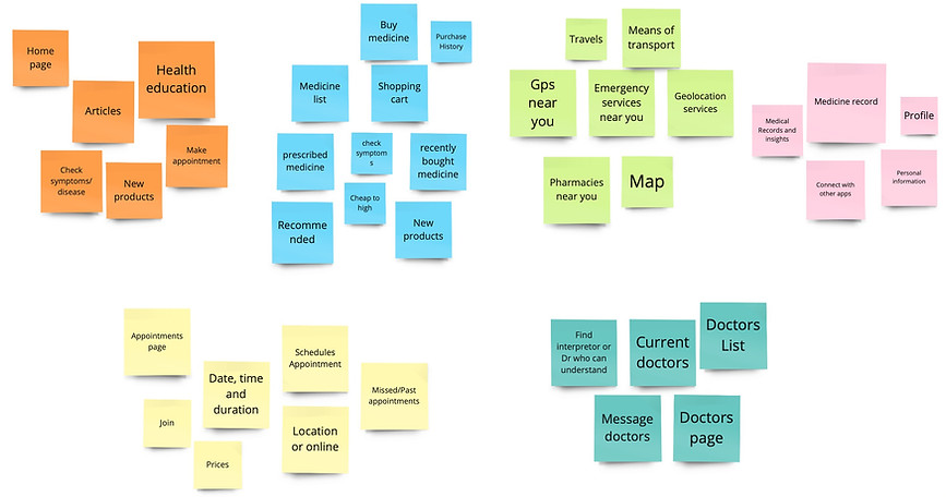
To ensure my telemedical app was intuitive for older adults and supported multiple languages, I conducted a card sorting exercise. Participants categorized various functionalities (e.g., scheduling, consultations, medical records) in ways that made sense to them. This informed my decision to prioritize essential functions on the main screen, making the app easier to navigate
Information Architecture
I created an information architecture diagram to organise and structure the content in my app in an intuitive way for users.
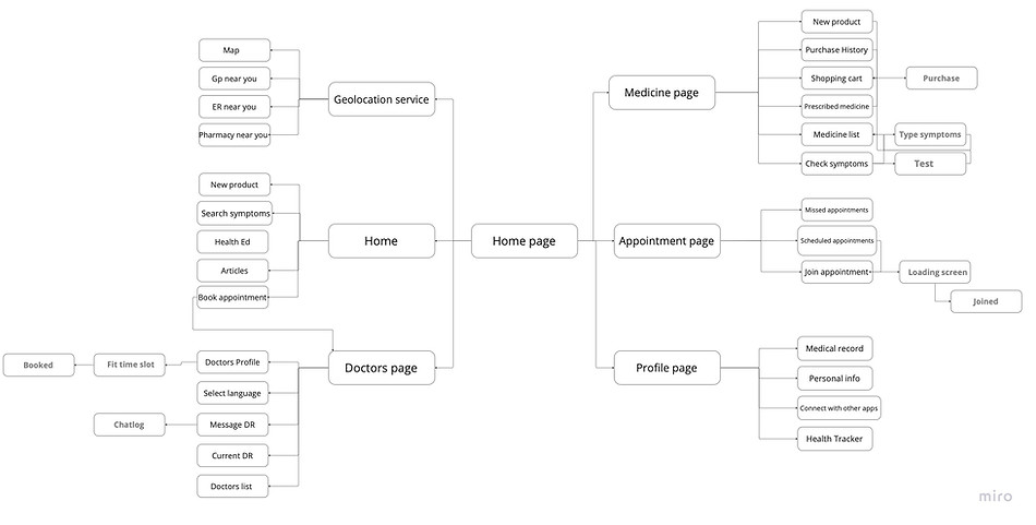
I designed it to address these pain points, ensuring a clear, straightforward structure with easy access to emergency help and multilingual support.
User Flow
I created a user flow diagram to understand the user's journey through my app and highlight any steps that are missing or unnecessary.
Get started
New user?
Yes
No
Create account
Log in
Password correct
No
Enter email
Reset Password
Home
Yes
Profile
Buy Medicine
Geolocation service
Doctors page
Health ED
Articles
Check symptoms
Book appointment
New products
Join
Scheduled
Past
ER services near
Gp near you
Choose doctor
Message
Assigned doctors
Map
Appointment page
Medical records
connect with apps
Pharmacy near you
Shopping cart
Medicine list
Check symptoms
Prescribed medicine
Shopping History
personal info
The user flow was designed to be simple and direct, crucial for users in remote areas and older adults. Starting from the login screen, users can easily schedule an appointment, start a virtual consultation, or access their medical records. I included a map button on the home screen for immediate access to emergency help locations. The flow was made to minimize steps and make navigation intuitive.
The Initial Designs + Ideas:
Initially, due to my own experiences, I wanted the app to be like a portal, including the GP and the user only. However, I wanted to broaden my target market by involving those who may not have access to the GP at all, so I made it so you can log in with your email. For my logo, I chose the Bowl Of Hygeia- a symbol of good health and healing. I also made my app an offline service so it can be accessed by those who do not have internet access.
Initial wireframes focused on simplicity and clarity, with large buttons and straightforward navigation to help older adults. Furthermore, to overcome pain points like understanding icons and text, I added clear labels with simple fonts and language options.
Doctors Screens

Homescreens

Version 1
Version 2
I chose to redesign this so that the home screen became less cluttered.

Geolocation

Profile screen


Appointments screen

Medicines screen

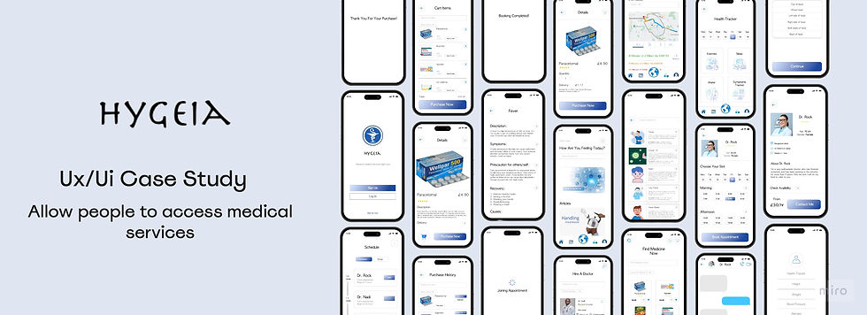
The Final Prototypes
1
Health education:
-
If people cannot afford appointments, they should at least be able to self-educate and diagnose themselves.
-
However, to reduce the possibility of any inaccurate self-diagnosis, I have designed the product to be as detailed as can be for users to make an informed decision.
-
This means that users can reduce costs and spend money only on medicine.


2
Multilingual Support:
-
Most people cannot understand the doctor's language and need an interpreter. However, this reduces the time left in the appointment. Often, the interpreter cannot fully translate what the patient needs.
-
Likewise, the interpreter may not fully understand medical terms and what the patient needs to do.
-
Therefore, I understood that it would be better for the doctor to be matched with a patient who could understand what was being said.
-
Appointments would solve the issue of patients who are incapable of travel.
3
-
Patients often will not know health services that are near them and travel far. This will help reduce any travel.
-
Likewise, during an emergency, people who have spectated or experienced some trouble will not know any close services and travel to a local health service.
Geolocation Services:


4
Online Medicine shopping
-
The journey from the doctor to the pharmacy can be exhausting. So, I concocted a feature that allows users to find the medicine online and have it delivered to them.
-
Often, medicine can also run out, and this will make the exhausting journey unnecessary. This feature can help avoid this.
-
Likewise, through the message feature, users can remember what medicine is prescribed for them to take- or the doctor can link it to them.
The Final Screens
The final app design features a clean, intuitive interface with large, clearly labeled buttons and multilingual support


Thank you for your time
Hygeia made by Neesham
©2023 by Neesham Thamsuhang's UX Portfolio. Proudly created with Wix.com