
Reframing assumptions and reimagining the future
"Messiness becomes a force of knowing."
Making As Enquiry: Experimenting & Iterating
The Brief:
Our goal, set by our university, was to explore daily interactions through repetitive prototyping, encouraging a fresh perspective on ordinary tasks.
The Team:
Neesham (Me)
Bimi Rai
Adan Attig
Sean Evans
Our Design Enquiry:
We reimagined how people study and socialise anonymously in the canteen using futuristic life pods with an agony aunt feature.
Research
Observation:
(Martin and Hannington, 2012) Suggest AEIOUs help create worksheets for note categorisation. Our group used AEIOUs to organise observations, gather insights, and ask questions. In the canteen, people mainly ate, studied, or used devices. The environment was social, colourful, and hectic, with interactions around menus, card readers, chairs, tables, devices, and utensils. Users, mostly students, came to eat, study, socialise, or staff

Figure 1. We used AEIOUs to organise observations, gather insights, and pose questions.

Figure 2. Our insights reveal the canteen as a hybrid space with various activities, leading to overuse as people spread out, avoid interaction, and occupy chairs and tables with personal items.
Observation continued:
Due to space limits, we collected data on bag and seat use at various times and studied how people navigate the canteen. Figures 3 and 4 display sketches of user movement. Observing unsuspecting individuals helps understand how they navigate the space, use tables and chairs, and spend time in the canteen naturally. Stickdorn, Marc. (ed.) (2018) also notes that non-participant observations reveal the gap between what people say and do.

Figure 3.

Figure 4.
Figures 3 and 4. The sketch I drew displays people walking from the entrance near space A towards the spaces O and M at 13:00 (refer to image 5)
Additionally...
I created an eagle eye map of the canteen with labelled areas for our research. Refer to Figure 5. Stars show occupied seats; triangles show occupied tables; colours indicate zones.

Figure 5. The tables show occupied seats and tables on different days and times of the day for 30 minutes.
After researching...
We researched buffer zones and Faraday cages to aid our ideation process in creating something helpful. Refer to Figures 6 and 7.
Malpass (2015) states speculative design should “make sense and reference real things,” despite being “exaggerated and manipulated.” It involves “domestication of emerging ideas in science and tech.” We researched the Faraday Cage, which prevents electromagnetic waves, to develop a booth that keeps students focused by blocking device distractions.
We researched buffer zones to improve comfort and reduce distraction. People have an innate personal bubble that causes discomfort when intruded upon, based on relationships, as T. Hall (1966) explains. We used this to create more space without infringing on personal bubbles.

Figure 6. The image shows zones for different individuals relative to the person. (westsidetoastmasters, no date)
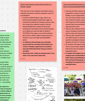
Figure 7. The image shows our research into the Faraday Cage, buffer zones, and personal space
Ideation
After identifying the spatial issues, we brainstormed solutions. Stickdorn (2018) says brainstorming helps find a “starting point” and widens options. We generated ideas to begin.
Using crazy 8s, we explored creative solutions for furniture and expanding personal space. After doing our crazy 8s, we picked our favourite ideas, expanded on them, and listed their pros and cons. We then explained each idea and provided feedback for improvement.
My idea was to create study rooms inside walls, inspired by canteen staff rooms, to solve space issues and give students a similar space. Refer to Figure 9.

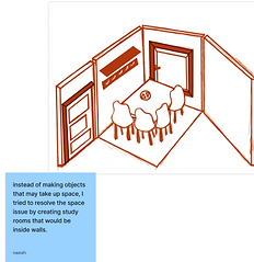
Figure 8. The image shows my crazy 8s
Figure 9. The image shows an improved illustration of my selected idea

Figure 10. Bimi’s selected idea
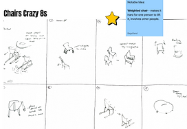
Figure 11. The image shows Sean’s crazy 8s

Figure 12. Adan’s selected idea
Initial Physical Prototypes
Once we chose our main idea, we each created prototypes using cheap and convenient materials like paper and cardboard to test the design feasibility.
We gathered to discuss ideas and possible paths, considering ways to combine them. However, it was too complex. So, we decided to focus on creating an enclosed space for students with various features.
My physical prototype resembles a classroom, but for a smaller group. It includes a table with chairs, shelves, whiteboards, and a window. Refer to Figure 14.


Figure 13. These images show the sequence of how Sean’s weighted chair might be used. Initially, a single person may be unable to lift it, so a second person joins, prompting interaction.
Figure 14. My physical study room prototype
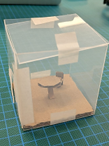
Figure 15. Adan’s physical room prototype

Figure 16. Bimi’s physical seating prototype
User Testing
After completing prototypes, we tested our ideas through role-play and feedback to identify friction points and improvements for our room idea.
During initial research, I used design methods from Hannington & Martin (2012). I tested strangers’ reactions to my prototype by asking them to choose descriptive words, mainly: fresh, creative, professional, and trustworthy. I also did a SUS test for quick feedback, scoring 87.5, indicating good usability (above 68). Since our final idea was similar to mine, I believed my research would be helpful. Refer to Figure 17.
During our initial research, we used design methods from Hannington & Martin (2012). We conducted a desirability test on strangers to get authentic reactions, such as confusion, appreciation, curiosity, and interest, then worked on turning confusion into understanding.
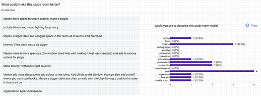
Figure 17. These image shows the results of my test, which 8 people had participated in. I conducted a SUS and desirability test, and asked for general feedback.

Figure 18. This image shows Adan’s test results, where strangers drew what they’d like in our room.
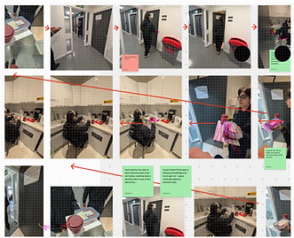
Figure 19. These images show our role-play sequence. We observed friction, such as users unable to hear fire alarms through soundproof walls, posing a risk.
Iterations
During ideation, we brainstormed prototypes to address space issues in the canteen. (Jan Stappers and Giaccardi, 2017) State design usually aims to create specific solutions. Our designs focused on reducing space use, but our teacher clarified that our goal wasn’t to solve a problem. They encouraged us to have fun and reinvent experiences. We then created a new design enabling users to interact freely while studying.
I finished my Crazy 8s and chose a futuristic spaceship sketch for the study room, but rejected it because the final had to be life-sized. See figure 21.
We designed a life-sized chair with storage, featuring retractable or Bluetooth headphones inspired by silent concert headphones, enabling users to communicate on different channels.
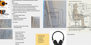
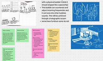
Figure 20. These images show the research inspiring our product design. We researched comfort, consulting Henry Dreyfuss (1959), and considered foot space, sight lines, and adjustability.
Figure 21. These images show my more speculative crazy 8s, including my spaceship design. It also includes feedback from team members.

Figure 22. This image shows the sketches of our idea
Physical Prototypes
We initially built on a small scale with paper because testing functionality was the priority, and Stickdorn, Marc. (ed.) (2018) says they are helpful for exploring design directions as they are easy to change, and they emphasise their strengths in look and feel. From the front, the user is able to see the storage compartment, and from the side, they will see the headphones for interaction. Refer to Figure 23.
We built a full-sized version with a chair, headphones, and paper mimicking the bag storage. A sign saying “talk to strangers” was placed near the headphones for interaction, illustrating Norman’s (2013) concept of affordances and signifiers. Since strangers aren’t expected behind headphones, the signifier helps users understand its purpose. We tested the model for comfort and usability. Refer to Figure 24


Figure 23. Our small scale prototype. From the front, the user is able to see the storage compartment, and from the side they will see the headphones for interaction.
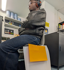
Figure 24. Our physical life-size prototype
User Testing
We tested our product in the canteen with strangers and classmates, mainly seeking feedback. Most was positive, but some raised concerns about anonymity enabling hate speech, prompting us to consider adding guidelines. Refer to figure 25.


Figure 25. A collection of feedback from 5 strangers and 5 classmates. The red is from strangers, and the black is from classmates.
Our Last Iteration
Walton (2011) suggests designers should enhance a usable interface’s appearance, likening interfaces to nutritious, flavourful food. I agree, questioning why we settle for a simple look after usability. User feedback also influenced this dome design with a cushioned seat, as our prototype lacked appeal and comfort. I aimed for a futuristic aesthetic, fitting a speculative design that Malpass (2015) describes as making sense and referencing real things, even with exaggerations, involving the “domestication of emerging ideas in science and tech.”
During our design process, we repeatedly used Schön’s ‘reflection-in-action’, making real-time choices and adjustments. When users found our design confusing, we quickly modified it for clarity, adding ergonomic features for comfort and efficiency. I also proposed a navigation screen with tutorials and guidelines.
During our design process, we created a dome-like object without exterior instructions. (W. Gaver, 2012) suggests ambiguity can be intentional to “compel” people. Our futuristic, life pod-like chair aims to challenge user-object relationships and make interactions exciting.
Everything was inside the dome, but the storage remained below the chair. After feedback, we added an agony aunt feature for volunteers to share problems sent to other pods for advice.

Figure 26. A more detailed sketch of our ideal piece made by me
Research For Our Last Iteration
After choosing the object’s appearance, we researched making the dome sensory immersive, including lighting, materials, scent, colour, and sound.
Delloye (2025) recommends cool white light (4000-5000K) to reduce eye strain. Herrera (2023) notes that warm lighting improves comfort, mood, and social interaction. We added a remote for users to select optimal lighting.
Each colour impacts people differently. (Hendrix, 2025) states yellow boosts mood, fitting for social and learning settings.
Similarly, (Aery Living, 2025) suggests each scenario needs different scents, so we included a scent diffuser.
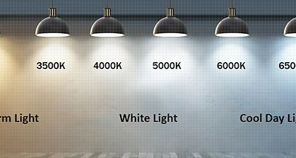
Figure 27. An image displaying what each light looks like. (LunnArk, no date)

Figure 28. A table that suggests which scents are suitable for what task. (Aery Living, 2025)
Research continued:

Visual Learners work best in silence or soft white noise
For neurodivergent Learners sound preferences are highly individual


For logical tasks, Moderate-tempo instrumental music or total silence are effective
Kinesthetic Learners work best in upbeat music

Auditory Learners work best in consistent background music or ambient sounds
For writing tasks, film scores, lo-fi beats, or soft jazz are effective


For creative tasks, upbeat and your favourited music are effective
For memory tasks, constant repetitive music are effective

Material research:
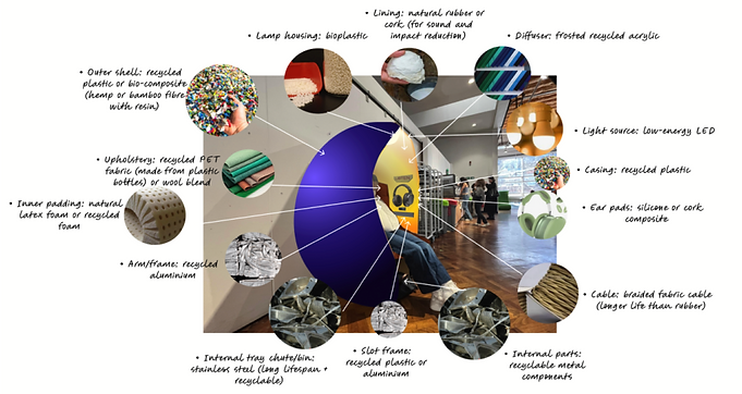
Figure 29. This image illustrates the various materials we would use in our ideal design. Bimi produced this diagram to highlight the different materials for each feature, aiming to enhance user comfort and improve the chair’s ergonomics.
Building Our Product
Before building, we measured the chair and drew around a picture of it to visualise stable structures.
Drawing from Stickdorn (2018), we used cardboard to prototype, arguing it “further explores and validates core functionality.” We also made a life-sized model for an immersive experience, enabling “deeper exploration” of our product in the canteen.
We glued a plastic cup on the ceiling to mirror our lighting and drew headphones, glueing them inside as per our original sketch.
During product development, I used ‘research through design,’ where prototypes generate knowledge. Initially planning to use triangles, we switched to cardboard rectangles and trapeziums due to time and complexity, with detailed measurements before cutting. To improve stability, we added mini rectangles as hinges and small triangles to support the ceiling and prevent collapse.
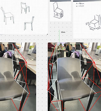
Figure 30. An image displaying how we wanted our structure to look.
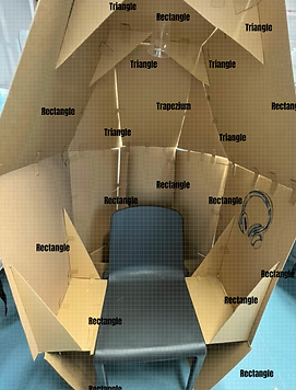
Figure 31. An image of our physical prototype with labelled shapes.
The Final Product
Houde and Hill (1997) see prototypes as symbols, like a brick for weight and a scale for future artefacts, emphasising designers’ use of objects to explore or represent the future. Since we couldn’t make a high-quality artefact, we used an existing chair and cardboard. I sketched its potential look with more skills and time, and a team member made a collage of the future piece.

Figure 32. An image of our physical prototype in the canteen.
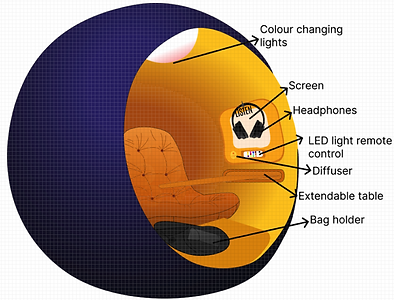
Figure 33. An illustration I created of what our physical prototype might look like.

Figure 34. An illustration of what our physical prototype might look like. A collage made by our team member, Bimi.
Reflections
This unit focused on everyday interactions and how to reimagine them through iterative prototyping. As a group, we aimed to redesign how people study and socialise in the canteen. I was influenced by J Stappers and Giaccardi (2017), who argue that the primary goal of design is usually to create a specific solution. With this perspective, I focused on making our design a solution for users who want to study and socialise in the canteen. Similarly, Malpass (2015) believes that speculative design should be exaggerated yet make sense, involving the domestication of emerging ideas. Based on this, I wanted our final concept to feel futuristic and technical but still grounded in reality. This evaluation discusses how these theoretical frameworks influenced my decisions throughout the project. Additionally, I will describe how my understanding of UX Design has developed over the course of this project.
I applied Houde and Hill’s (1997) idea that a prototype, like a brick representing scale or weight, could be acceptable, which motivated me since only high-fidelity prototypes seemed valid. Lacking time and capability, we considered using cardboard to depict our future piece. I also used Gaver’s (2012) concept that ambiguity can draw users in; since our object was often misunderstood as a chair, we aimed to turn confusion into curiosity and intrigue.
Initially, I believed our design had to solve an existing problem. However, during the course, I realised that design doesn't necessarily need to address a problem; it can also involve viewing existing things from a more creative or different perspective. This insight shaped my approach as a designer, making it less about finding solutions and more about exploring freely. Similarly, I initially thought our prototype had to be a finished product of our idea. Through making, I now understand that not all prototypes can be fully realised at once. Designers often need to adapt and create something that simply mimics and represents the experience of their ideal object. I also initially thought AEIOUs were unnecessary and that general observation was enough. Looking back, I see that organising observations under those categories made subsequent steps much easier. Furthermore, I became attached to many designs and spent time refining and testing them. In the future, I will aim to detach emotionally from individual designs and evaluate them more objectively.
In conclusion, this course taught me that not all design outcomes need to be about finding a definitive solution; they can also focus on reinventing existing things. I realised that our final piece doesn’t have to be the ultimate version but can instead embody the experience it conveys. Additionally, I learned that ambiguity isn’t always a drawback in design and can add depth. For our group project, we referenced Dr. Malpass’s point that speculative design should involve the “domestication of emerging ideas in science and tech” to develop our final product. I also considered Walton’s idea that, since the afternoon face is functional, we should enhance its appearance. This has shifted my view of UX design from a purely solution-focused, aesthetic, and intuitive approach to one that allows more creative freedom.
Bibliography
Delloye, E. (2025) ‘Optimizing Your Study Environment: Choosing the Best Color Light for Reading and Learning’. Available at: https://myluminette.com/en-gb/blogs/article/optimizing-your-study-environment-choosing-the-best-color-light-for-reading-and-learning.
Donald. A, S. (1983) ‘The Reflective Practitioner’. Available at: https://raggeduniversity.co.uk/wp-content/uploads/2025/03/1_x_Donald-A.-Schon-The-Reflective-Practitioner_-How-Professionals-Think-In-Action-Basic-Books-1984_redactedaa_compressed3.pdf.
Frayling, C. (1993) ‘Research in Art and Design.’ Available at: https://antle.iat.sfu.ca/wp-content/uploads/2018/08/Frayling.pdf.
Herrera, E. (2023) ‘The Psychology of Light: How Different Lighting Impacts Our Emotions’. Available at: https://www.vonn.com/blogs/articles/the-psychology-of-light-how-different-lighting-impacts-our-emotions#:~:text=Warm%20lighting%2C%20often%20characterized%20by,seek%20comfort%20and%20emotional%20support.
Houde, S. and Hill, C. (1997) ‘What do Prototypes Prototype?’ Available at: https://hci.stanford.edu/courses/cs247/2012/readings/WhatDoPrototypesPrototype.pdf.
J Stappers, P. and Giaccardi, E. (2017) ‘Research through Design’. Available at: https://www.interaction-design.org/literature/book/the-encyclopedia-of-human-computer-interaction-2nd-ed/research-through-design?srsltid=AfmBOor4EYqpjJmOetiTn2K34XWLURN73dkpcS_YXkyCNDrsTSY3UHrU.
LunnArk (no date) ‘Why 4000K Lighting is the Perfect Balance for Modern Spaces’. Available at: https://www.lunnark.com/blogs/why-4000k-lighting-is-the-perfect-balance-for-modern-spaces.
Malpass, D.M. (2015) ‘Between Wit and Reason: Defining Associative, Speculative, and Critical Design in Practice’. Available at: https://www.burg-halle.de/id-neuwerk/post-exit/wp-content/uploads/sites/55/2019/02/Malpass-Mat-2013-Between-Wit-an-reason_Defining-Associative-Sepeculative-and-Critical-Design-in-Practice.pdf.
Martin, B. and Hannington, B. (2012) ‘Universal Methods of Design’. Available at: https://assets.super.so/9bd43d2f-3d87-4399-bcf0-c72619825ed8/files/a8e97f99-0b36-4e2e-9dd7-3def0f66add8.pdf.
Norman, D. (2013) ‘THE DESIGN OF EVERYDAY THINGS’. Available at: https://ia902800.us.archive.org/3/items/thedesignofeverydaythingsbydonnorman/The%20Design%20of%20Everyday%20Things%20by%20Don%20Norman.pdf.
NU Editorial Contributors (2025) ‘Can Music Help You Study and Focus? [Updated 2026]’. Available at: https://www.nu.edu/blog/can-music-help-you-study-and-focus/#:~:text=If%20you%27re%20reading%20or,focus%20without%20overwhelming%20your%20brain.
Stickdorn, Marc. (ed.) (2018) This Is Service Design Methods. O'Reilly Media.
T. Hall, E. (1966) ‘The hidden Dimension’. Available at: https://online.fliphtml5.com/waiom/kdov/#p=1.
Walton, A. (2011) ‘Designing for Emotion’. Available at: https://theswissbay.ch/pdf/Gentoomen%20Library/The%20Actually%20Useful%20Programming%20Library/Design/Designing%20for%20Emotion%20-%20Spool%20-%20A%20Book%20Apart%20(2011).pdf
westsidetoastmasters (no date) ‘https://westsidetoastmasters.com/resources/book_of_body_language/chap9.html’. Available at: https://westsidetoastmasters.com/resources/book_of_body_language/chap9.html.
W. Gaver, W. (2012) ‘Ambiguity as a Resource for Design’. Available at: https://www.researchgate.net/publication/2903668_Ambiguity_as_a_Resource_for_Design.